Democracy Dollars
Summary
My team collaborated with the Public Ethics Commission of the City of Oakland to prototype and test the experience for a new public campaign finance program.
Role: Lead Product Designer
Team: Worked closely with Oakland Public Ethics Commission and OpenOakland team of 5
Timeline: 2023-2024 (multi-month civic initiative)
Tools: Figma, Miro, Zoom, Slack
Outcome: Designed the initial experience for Oakland’s new public campaign finance program for handoff to implementation team
Context and Problem
In 2022, Oakland voters passed the Fair Elections Act, a new public campaign financing initiative aimed at reducing the influence of big money in local politics. The key component of this act was “Democracy Dollars” — a program that gives residents vouchers they can donate to local candidates, essentially letting everyone participate in campaign funding.

I designed a promotional voucher incorporating the pattern from Oakland’s familiar tree logo with a display typeface to signal the start of a bold initiative.
But by 2024, many Oakland residents hadn’t heard of the program.
In our testing some had a vague recollection, and even fewer understood how it worked.
The city needed a digital platform where residents could first understand the program — and then assign their vouchers to the local candidates of their choice. Our team was tasked with prototyping and testing that core experience: could people not only grasp how Democracy Dollars worked, but also use a new system to participate in campaign funding directly?
The challenge was to design a tool that felt accessible, trustworthy, and easy to use — especially for residents who have historically been excluded from civic processes.
My Role
I led the end-to-end product design process as part of a civic tech collaboration between OpenOakland and the Oakland Public Ethics Commission. My responsibilities included:
Partnering with stakeholders to clarify program details and user needs
Translating policy language into simple, inviting messaging
Designing information architecture, wireframes, and high-fidelity visuals
Prototyping interaction flows
User testing and iteration on the designs
Throughout the project, I focused on designing for trust, simplicity, and accessibility — balancing civic accuracy with warmth and clarity.

Translating policy into a clear, user-first sitemap.
Research
We started by grounding our work in the realities of Oakland residents. Through conversations with community partners, city staff, and people in the neighborhoods most impacted by political inequity, we gained a clear picture of the existing landscape.
What we heard:
“I think I got something about this in the mail… maybe?”
“This sounds like something that’s just going to benefit the politicians.”
“Why would the city give me money to donate to someone else’s campaign?”
There was confusion. Skepticism. Curiosity.

We had to earn trust quickly. The idea of public funds going to candidates felt suspect to many people. Clear, honest language was essential.
We couldn’t rely on prior knowledge. For many residents, this was the first time hearing about Democracy Dollars.
We had to meet people where they were. That meant plain language, visual storytelling, and accessibility up front.
This early discovery work shaped every part of the experience we designed — from the way we structured the homepage, to the tone of voice, to the choice of illustrations.
Design Process
Once we understood the skepticism and confusion around Democracy Dollars, our goal became clear: design an experience that’s immediately understandable, visually inviting, and credible without feeling bureaucratic.
Wireframes
Early on, I sketched out concepts to explore tone and information flow. I worked closely with the team to ensure our language matched the program’s boundaries while still being human-centered.
This helped surface potential content gaps and areas of confusion early, which saved time in later stages.

Mailer
We considered the full user journey, not just the digital touchpoint. We designed with the awareness of where users are coming from (physical mailer) and where they’re going (digital site). This reflected system-level thinking, designing a cohesive experience across platforms.
I designed a mailer that would be sent to all eligible voters. This physical touchpoint included vouchers and introduced the program, helping establish credibility and guide users into the digital flow.

Working across channels allowed us to test and refine not just digital copy but also printed language, ensuring clarity and consistency from mailbox to mobile screen. Shaping the mailer’s tone, visuals and messaging would directly tie in to UX goals like trust-building.
Prototype and Test

To bring the experience to life, we created an interactive Figma prototype that allowed stakeholders to explore the flow, surface confusion points, and provide actionable feedback. Over the course of 10+ usability testing sessions with a diverse group of Oakland residents, we iterated on the design to address real concerns and improve task success rates by 17%.
Mobile prototype showing updated login language. Some participants were uncomfortable sharing personally identifying information. We revised the approach to emphasize that voters were finding an existing account — not registering for a new one — making the process feel more secure and familiar.
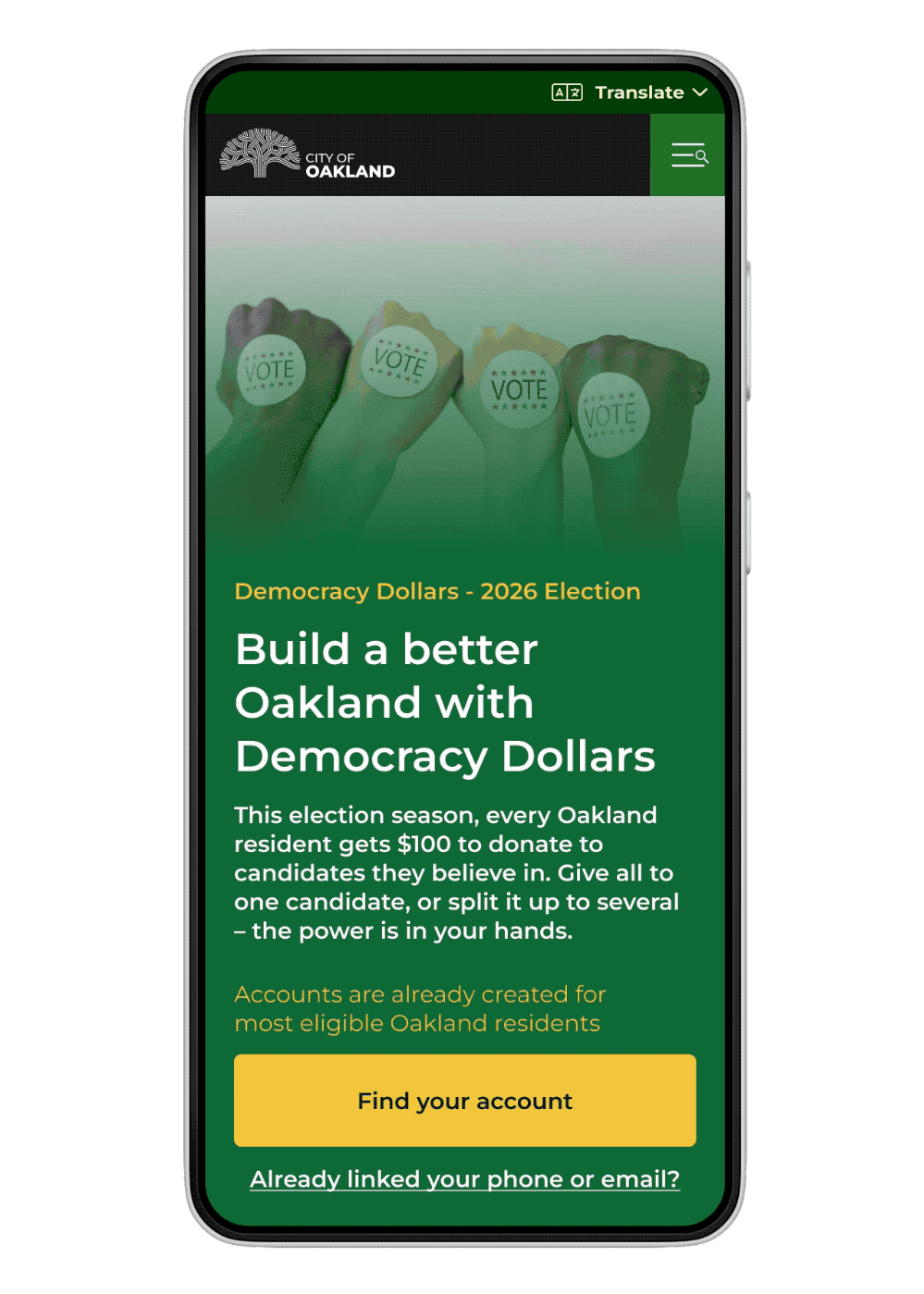
One key insight was the importance of framing. Users were wary of a government platform asking for personal data. Replacing the term “Register” with “Find your account” helped reduce friction and better aligned with the program’s structure: every eligible voter already had an account; they simply needed to access it.
Evolve for Clarity and Trust
Reframed login flow from “Register” to “Find your account” to reduce perceived risk.
Refined language and tone throughout the prototype to sound clear, helpful, and human — without sacrificing legal accuracy.
Addressed skepticism head-on by reinforcing that this was an official city initiative, backed by a physical mailer and The Public Ethics Commission.
Used ongoing testing feedback to simplify messaging and guide users step-by-step through the journey.
Testing wasn’t just about usability — it was about trust. Every word, interaction, and design decision needed to build confidence in a program many residents were hearing about for the first time.
Optimal Solution
Structure the Story
We developed a clear, welcoming informational site designed to introduce Oaklanders to Democracy Dollars and help them take action — whether that meant signing up for updates, checking eligibility, or just understanding the basics.

The landing page offers an option to find out more about how the program works and a call to action button to find your account. I paired this with a visual design system that was friendly and informative.
Visual & Interaction Design
Layout, typography, color, and imagery built trust, conveyed clarity, and supported comprehension. A step-by-step info page mapped out key questions:
What is this? Why should I care? How does it work? What happens next?

A modular explainer page breaks down the program in three clear steps, tailored to common resident questions.
Highlights of the final experience
A homepage that gets to the point
The top of the page clearly introduces Democracy Dollars with a bold headline, a get out the vote visual, and a plain-language invitation to learn more — helping users quickly understand what the program is and why it matters.
Step-by-step breakdown of how the program works
Instead of overwhelming users with policy details, we included a link to pages that explain the program. Once there, we walk through the process in three simple steps with supporting visuals. Each step addressed a a key moment in the user journey: receiving vouchers, choosing candidates, and donating.
Smart use of visuals to support comprehension
Custom illustrations and icons reinforced concepts without feeling childish. Every visual was purposeful — helping users connect unfamiliar terms with familiar experiences.
Built-in trust signals
We made it clear this was an official city initiative, backed by the Oakland Public Ethics Commission. This was reinforced through visual cues, tone of voice, and careful messaging.
Accessible and mobile-friendly
The site was built to be responsive and inclusive, with clear contrast, structured headings, and alt text throughout. It was mobile first design that worked just as well on a desktop.

Designed to grow with the program
Since the program was still in development, the site was designed to evolve. We created flexible components and a scalable structure so new content (like timelines, FAQs, or real-time updates) could be added without disrupting the experience.

Candidate guide component structure.
Reflection and Outcomes

Designing for Democracy Dollars wasn’t just about explaining a new program — it was about building trust in a civic process that many Oaklanders didn’t know existed. That made the design challenges especially meaningful.
We tested in three locations: Oakland City Hall, The Oakland Public Library Lakeview Branch, and The Black August Block Party to see how context affected usability.
What I learned
Clarity is a form of respect.
When dealing with unfamiliar or complex systems, the best thing you can do is meet people where they are. Every word and visual choice should help people feel informed — not overwhelmed or left out.
Storytelling builds trust.
Clear, intentional presentation of design decisions helps stakeholders understand, align, and feel confident in the direction. Good communication is good design.
Constraints can sharpen creativity.
Working within the bounds of legal language, campaign cycles, and community concerns pushed me to think more intentionally about every element. It taught me how to collaborate across disciplines while staying focused on the user.
What’s next
As of early 2025, the prototype is serving as an early tool for the implementation team while the city finalizes program logistics. The modular design makes it easy for city staff, contractors, and volunteers to update content as the launch approaches.
I’m excited to see how the program grows — and how this foundation helps more Oaklanders understand, trust, and participate in local democracy.
Testimonial
"OpenOakland's expertise in user research and design helped us transform Democracy Dollars from a policy mandate into a practical, user-friendly prototype. Their collaborative approach identified potential challenges early, saving us valuable time and resources while ensuring we're building something that truly works for all Oakland residents."
Suzanne Doran, Program Manager, Democracy Dollars, Oakland Public Ethics Commission